Backstage - OOC Forums

Please login or register.

Login with username, password and session length
Advanced search  

News:

That 'Ancestors choke!' is a Caldari expression of disbelief or astonishment?

Pages: 1 ... 28 29 [30] 31 32 33

Author Topic: Character Portrait Rating  (Read 153803 times)

Valadeus

  • Guest
Re: Character Portrait Rating
« Reply #435 on: 26 Jun 2015, 16:26 »

New portrait! See left! Or, if you want a larger size...spoiler below. Let me know what you think, I'm rather proud of it.

[spoiler][/spoiler]

Logged

Makkal

  • Pod Captain
  • Offline Offline
  • Posts: 837
  • Khanid victor
    • At the End of Your Journey
Re: Character Portrait Rating
« Reply #436 on: 26 Jun 2015, 20:23 »

Two years later and Makkal has only changed her shirt.


It helps with the neck though.
Logged
Ask not the sparrow how the eagle soars!

Current Events

Morwen Lagann

  • Pretty Chewtoy
  • The Mods
  • Demigod
  • Offline Offline
  • Posts: 3427
    • Lagging Behind
Re: Character Portrait Rating
« Reply #437 on: 05 Jul 2015, 10:09 »

Updated Morwen's pose for the first time in years. Style got tweaked a bit too while I was at it. (Click for 1024px version.)

Logged
Lagging Behind

Morwen's Law:
1) The number of capsuleer women who are bisexual is greater than the number who are lesbian.
2) Most of the former group appear lesbian due to a lack of suitable male partners to go around.
3) The lack of suitable male partners can be summed up in most cases thusly: interested, worth the air they breathe, available; pick two.

Korsavius

  • Cold Wind's Blade
  • Omelette
  • Offline Offline
  • Posts: 435
  • "Dead man walking."
Re: Character Portrait Rating
« Reply #438 on: 05 Jul 2015, 11:30 »

New Charlie portrait. R8/8. I'm still trying to go for the B-Movie vampire look, I guess. I don't know. He's pretty to me, at least.
[spoiler][/spoiler]

"Bitch, I may have a big unpleasant scar on my face but that don't stop me from looking fab."

New portrait! See left! Or, if you want a larger size...spoiler below. Let me know what you think, I'm rather proud of it.

[spoiler][/spoiler]


Eyebrows on fleek, gurl.

Updated Morwen's pose for the first time in years. Style got tweaked a bit too while I was at it. (Click for 1024px version.)

[spoiler][/spoiler]

I don't even know what to say. Very drastic change, I think. Good change.
Logged
Character Profile - last updated 10.14.17

Mizhir

  • Egger
  • Offline Offline
  • Posts: 173
  • Vherocool
Re: Character Portrait Rating
« Reply #439 on: 06 Jul 2015, 18:40 »

New portrait:

[spoiler][/spoiler]

The clipping sucks though :(
Logged

Aria Jenneth

  • Veteran
  • Offline Offline
  • Posts: 1124
Re: Character Portrait Rating
« Reply #440 on: 11 Jul 2015, 21:08 »

Also a new portrait:

[spoiler][/spoiler]

I always have trouble making these work at all levels of zoom. This one ...

... well, I think it works pretty well on this level. Smallest size is a little wrong, though.
« Last Edit: 11 Jul 2015, 21:14 by Aria Jenneth »
Logged

Lyn Farel

  • Guest
Re: Character Portrait Rating
« Reply #441 on: 12 Jul 2015, 02:46 »

Smallest sizes are always a little botched...

I like this one better.
Logged

Aria Jenneth

  • Veteran
  • Offline Offline
  • Posts: 1124
Re: Character Portrait Rating
« Reply #442 on: 12 Jul 2015, 10:38 »

I'm still tinkering with the lighting.
Logged

Kyoko Sakoda

  • Pod Captain
  • Offline Offline
  • Posts: 505
Re: Character Portrait Rating
« Reply #443 on: 13 Jul 2015, 23:13 »

Also a new portrait:

[spoiler][/spoiler]

I always have trouble making these work at all levels of zoom. This one ...

... well, I think it works pretty well on this level. Smallest size is a little wrong, though.

Design graduate critique incoming.

1) Rule of thirds is a bit off. For dynamic photos always make the focal point somewhere along those lines.
2) Along the same lines, the index vector (face and eye direction) clash too much with the body placement. If you want Aria to be looking slightly over her shoulder, try putting her body more toward the right of the frame.
3) Consider either a) outer clothing or b) a more angled shot to make the neck seem a little less pronounced.
Logged

Lyn Farel

  • Guest
Re: Character Portrait Rating
« Reply #444 on: 14 Jul 2015, 06:04 »

Giraffe necks are an anatomic fault of CCP though, not posing. An ongoing issue.
Logged

Ché Biko

  • Space Buddho-Commu-Nihilist
  • Veteran
  • Offline Offline
  • Posts: 1166
  • I'll face the stars or the abyss.
    • Biko's Backstage Character Thread
Re: Character Portrait Rating
« Reply #445 on: 14 Jul 2015, 15:06 »

I usually like Aria's portraits. Her expression tends to have the same sort of ambiguity that I try to put in Ché's...hmm, actually...this one of Aria is close to a mirror for Ché, but with left/right sides switched.
But anyway, the neck...I kinda like it for Aria, as it gives her sort of a bird-like frailty. And the eyes, I love the eyes, nice contrast. It makes me want to try how it would look like if the illuminated eye was dead center of the picture. The slight tilt of the head makes the eyebrows interesting, hard to read. The lighting gives her a cold and warm (maybe not warm, but softer) side. The mouth complements it all nicely.
...I can't really see anything I would change.
95/100

So, as I no longer have a reason to display my "corporate" red star shirt, I gradually reverted to what my portrait was like shortly after Incarna, more close up. Only, he appears a bit older now, his expression changed a tad, but this is close to his default neutral expression.

[spoiler][/spoiler]
Logged
-OOChé

Jennifer Starfall

  • Egger
  • Offline Offline
  • Posts: 138
Re: Character Portrait Rating
« Reply #446 on: 14 Jul 2015, 20:11 »

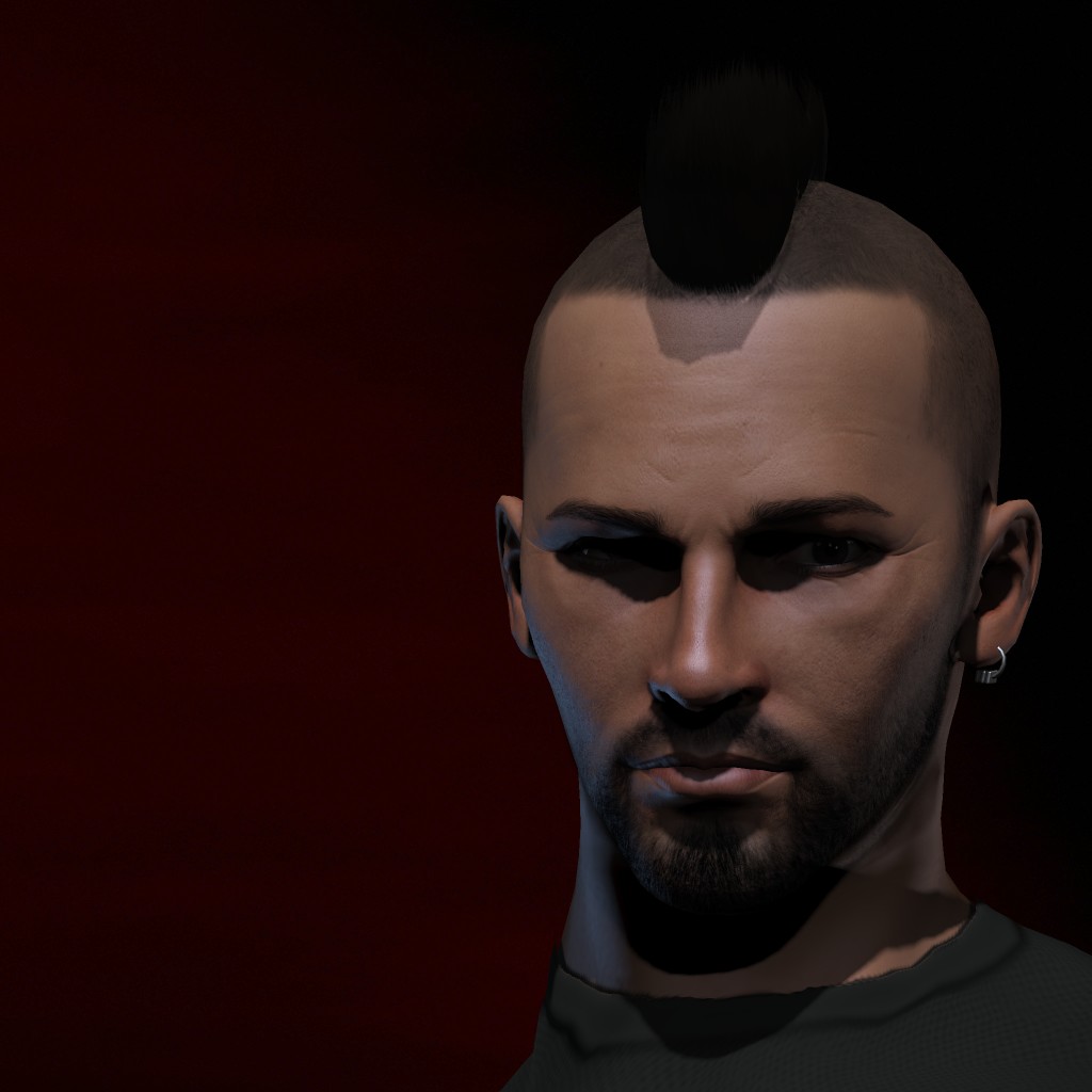
Jenn has a temporary new portrait.
Logged

Nissui

  • Guest
Re: Character Portrait Rating
« Reply #447 on: 15 Jul 2015, 01:42 »

Mad Jenn still hot.
Logged

Aria Jenneth

  • Veteran
  • Offline Offline
  • Posts: 1124
Re: Character Portrait Rating
« Reply #448 on: 15 Jul 2015, 09:24 »

Also a new portrait:

[spoiler][/spoiler]

I always have trouble making these work at all levels of zoom. This one ...

... well, I think it works pretty well on this level. Smallest size is a little wrong, though.

Design graduate critique incoming.

1) Rule of thirds is a bit off. For dynamic photos always make the focal point somewhere along those lines.
2) Along the same lines, the index vector (face and eye direction) clash too much with the body placement. If you want Aria to be looking slightly over her shoulder, try putting her body more toward the right of the frame.
3) Consider either a) outer clothing or b) a more angled shot to make the neck seem a little less pronounced.

It may have changed a bit since you last looked at it, Kyoko. I'd be interested in whether your thoughts have changed at all.

... light's still maybe not quite right, but that seems to be partly a problem of me trying to do this on a graphically gimped machine. My in-game render doesn't have the bright eye/dark eye thing going to nearly such a high degree.

Also: "Rule of thirds?"

<-- not a designer or student of design
Logged

Mizhara

  • Prophet of New Eden
  • Demigod
  • Offline Offline
  • Posts: 2545
  • The Truth will make ye Fret.
Re: Character Portrait Rating
« Reply #449 on: 15 Jul 2015, 09:29 »

Set up a three by three grid on your avatar or whatever else you're working on. For avatars this basically means one side of a rubik's cube. Align things accordingly along those lines for various effects. It's remarkably simple and works wonders. Eyes along one line, maybe centered where they intersect, etc.

Generally makes things look more alive and dynamic than a passport photo.
Logged


Pages: 1 ... 28 29 [30] 31 32 33