There may be a larger size but I've yet to learn of it.
I don't believe there is, at least not available publicly. The renders done by the server may be done larger.
Lessee, some of the more recent ones, going backwards...
Havo: The portrait itself is nicely done on its own merits, but doesn't really do a very good job of conveying the character I know Havo to be. It's too calm and open and innocent, with no hint of the more sinister, hostile behavior the character is associated with. Very jarring.
Aya: The background feels a little bland and too close to her skin tone, but you've definitely got her attitude portrayed accurately with the sunglasses and expression.
Gwen: Agreed about the hair. One of the reasons I don't really use the longer hair styles is that anti-grav tech seems to be included in the deal. The portrait really seems to suit the way the character has been portrayed in the past. The lack of even a slight touch of makeup around the eyes makes her look a little like she just got out of bed (which is an issue with my own Achuran, imo - see below), but it's not very easy to notice unless you're looking for it and using the high-res portraits.
Saede: Agreed with most of the other comments here - you've done a pretty good job of getting the 'tomboy' look already. I think easing up on some of the makeup would help it go further, but definitely not removing it wholesale.
Arnulf: I'm reminded of a Sid with hair, and slightly more sunken cheeks. There's something a little off about the portrait but I can't quite put my finger on it - it might be the way you've positioned him within the portrait off to one side, with the lighting.
Reppy: I kind of preferred the original post-Incursion one a bit to this, but her face definitely
needs deserves more showing off than that version allowed for, as proof that you -can- still make a pretty Khanid after the changes.
 Elysa:
 ... Yeah, what you said. I miss her older portrait, but with the direction you seem to be taking her in, a slightly gruffer, more :grr: look suits her. Also, I think it was less Carbon and more your machine at the time. I think I have MSN logs.
 Mortis:
 He looks good, but yeah. Helmet. Requiar.
Samira: You've always done a good job with her in your portraits, especially with taking advantage of the makeup settings to make her look like an addict. The removal of her tattoo draws attention to some of the ways Carbon is wibbly about cheekbones, though - it used to hide that pretty well.
Gabe: Sebiestor males always come off a little weird to me (it's mostly the cheeks), but I really, really like the contrast of his eyes to the background here.
Lady Merdaneth: Agreed with the others - really well-done but needs to take better advantage of the space available for the portrait. Early 30s in age?
Seph: I love the slight smile-less smirk on his face. The things on his forehead seem a little... off, though, and I think you could make better use of the space available. Maybe try turning him a little to make the portrait less static.
Korsavius: Very good, though it comes off as... more sinister than Kor gives the impression of being, IC. Also: I'm waiting for someone to Goa'uld-ize it.
Che: Good, but I think that the open space on the left doesn't really add as much to the portrait as using it might.
Shin: The black lipstick feels off, but the attentive expression suits her well.

Guess I should throw mine into the mix. Displaying the 512px versions; 1024px versions can be viewed by clicking.
Morwen Lagann: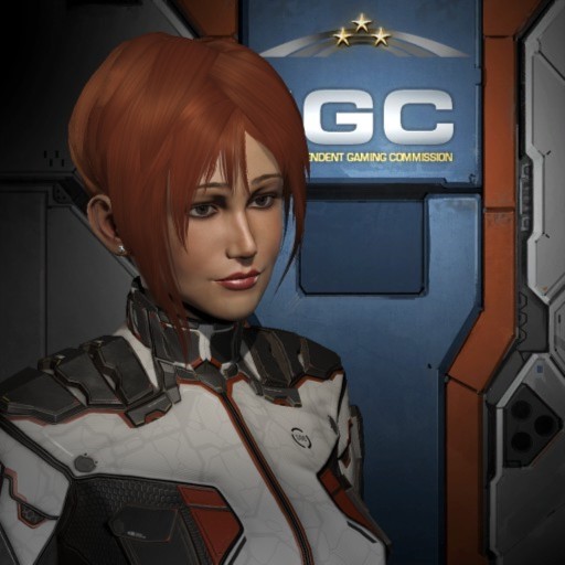 Mirelle "Momwen" Lagann
 (yes, actually used for RP):
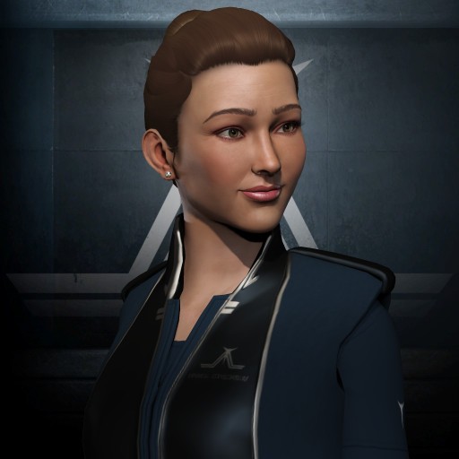 Naoko Kanaka
 (Original main, used to RP with, not as much anymore):
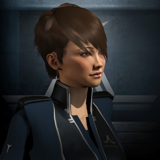 Suzelle Dullere
 (Morwen's XO, referenced in RP, rarely used):
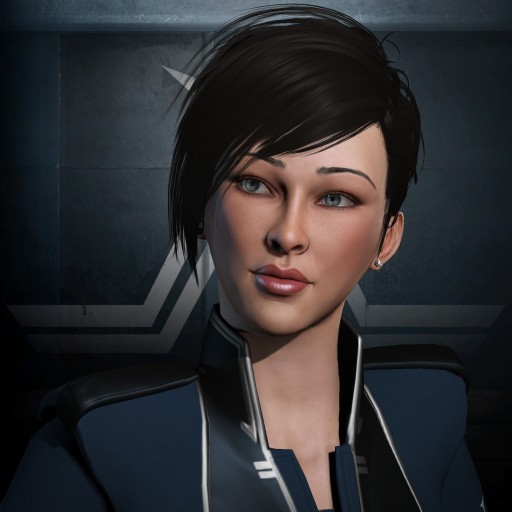 Keta Lindur
 (Referenced in RP, never used):
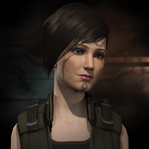 Ophelia "Feely" Kiselouvre
 (Not really an RP character... yet):
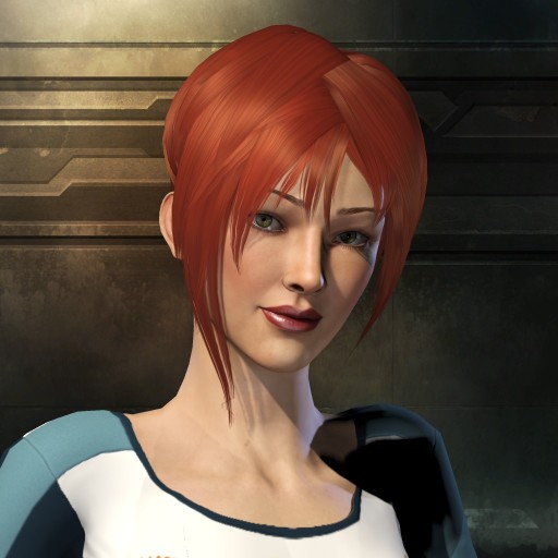
There's a bunch of really minor tweaks I want to make to most of them. Morwen's lips feel a little wide (might just be the lipstick or lighting), Naoko needs a touch-up around the eyes, and Feely's chin feels a little weird (:effort: to shell out a plex to fix it, might see if a different pose works better sometime).
(Edit - removed the table to be more friendly to smaller screens; came out wider than I intended.)

 Author
Topic: Character Portrait Rating (Read 184881 times)

