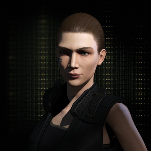
Backstage - OOC Forums

Please login or register.

Login with username, password and session length
Advanced search  

News:

That ship crews only perform cleanup, maintenance, and lower-order operations on ships? (The Burning Life p 31)

Pages: 1 ... 7 8 [9] 10 11 ... 33

Author Topic: Character Portrait Rating  (Read 154015 times)

Anslol

  • Guest
Re: Character Portrait Rating
« Reply #120 on: 11 Jun 2013, 09:21 »

Anslo: Too many clicks in the body mod category  ;) but he's cute. Personality aside, Lasa would hit on him.

That's a first.

As for Shin, 0/10, looks like an alien. Stay away from my spleen you human eater.

#realtalk#dropthemic: 8/10 would cuddle. Would be a 9, but the hair has me confused. Aside from that, she's good.
Logged

BloodBird

  • Intaki Still-Rager
  • Veteran
  • Offline Offline
  • Posts: 1635
  • The untraditional traditionalist
Re: Character Portrait Rating
« Reply #121 on: 11 Jun 2013, 10:11 »

Handsome, despite all the facial hardware. Though I wonder if he gets crap from the Minmatar for that facial tattoo...

Should that happen Anslo will be in the perfect spot to slap them silly for their clear bias and foolish belief that any tattoos are Minmatar only. Anslo's tat is Fed-centric and has nothing to do with the Matari, much like pretty much any other Fed character of Gallente/Jin-Mei/Intaki origin.
Logged

Ché Biko

  • Space Buddho-Commu-Nihilist
  • Veteran
  • Offline Offline
  • Posts: 1166
  • I'll face the stars or the abyss.
    • Biko's Backstage Character Thread
Re: Character Portrait Rating
« Reply #122 on: 11 Jun 2013, 10:13 »

I like her expression. And the hair.
But Shintoko looks too cartoony for my tastes. I don't really know why, as each part of her face looks fine, but how it all comes together is a bit...weird. I think it's mostly the smooth skin and the lips. The neck is a bit wierd too. And I don't feel the background fits with her appearance.
I think I would use less make up, make the lips smaller and the skin less smooth, and use a pose that would give the neck less of a "bend".
54/100
Logged
-OOChé

Lasairiona

  • Red
  • Omelette
  • Offline Offline
  • Posts: 289
Re: Character Portrait Rating
« Reply #123 on: 11 Jun 2013, 10:40 »

Sorry, Che. Mohawks are a big thumbs down for me.
Logged

Lyn Farel

  • Guest
Re: Character Portrait Rating
« Reply #124 on: 11 Jun 2013, 14:09 »

There is something in Ché's pose. Wrinkles at the corner of the eyes, make him look wise.

The neck is a bit wierd too.

Giraffe necks and shoulders stretched in the back for females in Eve mostly, which hurts my anatomical sense. Much like on that old gallente green flavor pic from day one.

Usually the neck starts to look like that when you don't add a jacket or something. It's very hard to hide.
Logged

Saede Riordan

  • Immoral Compass
  • Demigod
  • Offline Offline
  • Posts: 2656
  • Through the distorted lens I found a cure
    • All the cool hippies have tumblr
Re: Character Portrait Rating
« Reply #125 on: 12 Jun 2013, 11:43 »

any thoughts on Saede since I changed her jacket?
Logged
Personal Blog//Character Blog
A ship in harbour is safe, but that's not what ships are built for.

Korsavius

  • Cold Wind's Blade
  • Omelette
  • Offline Offline
  • Posts: 435
  • "Dead man walking."
Re: Character Portrait Rating
« Reply #126 on: 12 Jun 2013, 12:02 »

Look into my soul.
Logged
Character Profile - last updated 10.14.17

Sepherim

  • Omelette
  • Offline Offline
  • Posts: 392
  • Too fucking serious for himself... or not
    • The Chronicles of Sepherim Catillah
Re: Character Portrait Rating
« Reply #127 on: 13 Jun 2013, 08:35 »

Korsavius I like. Scary and sinister, but not in an obvious way. He seems to convey the sense that violence could erupt and break out at any moment without warning. And that direct look definitely seems to say "you got all the tickets to that violence, man!". Even the background fits perfectly. 95/100.

There's a sadness about all of Lasa's portraits that I find more interesting than the fact that she's attractive.

Sadness? I thought it was dreamy, a bit ethereal, but not sad. :? Oh, and 85/100.

Quote from: Lyn Farel
There is something in Ché's pose. Wrinkles at the corner of the eyes, make him look wise.

Yup no doubt, also gives the look of someone who has seen much in his life, which fits the character a lot. Though I agree about the mohawks. xD 90/100.

Logged

Merdaneth

  • Pod Captain
  • Offline Offline
  • Posts: 557
Re: Character Portrait Rating
« Reply #128 on: 13 Jun 2013, 16:23 »

I love seeing these portraits! Also I think they keep getting better with the years. People seem to get better and better at achieving a good effect. The mood of Korsavius is just *wow*, excellent! I like Sepherim, but the expression is a bit off, too blank. Try suggest making him look into the camera more, or a bit away from it more.

Here's my attempt at a homely Amarr girl:

Logged

Gabriel Darkefyre

  • Clonejack
  • Offline Offline
  • Posts: 40
Re: Character Portrait Rating
« Reply #129 on: 13 Jun 2013, 17:10 »

Not so sure on that last one, it's almost like the lights are on, but nobody's home. Might just be how the eyes are positioned though, she seems to be focussing on something beyond the person she's looking at. Could just be me though.

[spoiler]

[/spoiler]
« Last Edit: 13 Jun 2013, 17:15 by Gabriel Darkefyre »
Logged

Merdaneth

  • Pod Captain
  • Offline Offline
  • Posts: 557
Re: Character Portrait Rating
« Reply #130 on: 14 Jun 2013, 10:35 »

Not so sure on that last one, it's almost like the lights are on, but nobody's home. Might just be how the eyes are positioned though, she seems to be focussing on something beyond the person she's looking at. Could just be me though.

Well, I was trying to capture a daydreamer like quality. A bit naive girl more involved in her inner fantasies and hopes than the outside world. So maybe I got the feeling right. Sometimes moving the pupils a a few pixels can make a world of difference.

Or since they've started airing Game of Thrones I can now call it the 'Sansa Stark type'.
Logged

Samira Kernher

  • Soulless Puppet
  • Veteran
  • Offline Offline
  • Posts: 1331
  • Ardishapur Victor
Re: Character Portrait Rating
« Reply #131 on: 14 Jun 2013, 13:32 »

[spoiler][/spoiler]

Have to say, I vastly preferred Che's old portrait. It had good posture, good lighting, and good framing. This one feels fairly bland, and the framing is very off. There's a ton of empty space with no balancing element to make up for it. I'd recommend pulling the camera in a bit, and moving the character closer to the center--or finding a background that adds a strong visual element to the left side.

All that said, the expression is good, and the lighting has some nice contrast.

Look into my soul.
[spoiler][/spoiler]

I've always loved Korsavius' portrait. The best portraits, IMO, display the character, and Kor's has a lot of character. The lighting is also well-done and sets a great mood. He is a definitive Scary Black Man.

[spoiler][/spoiler]

Can't say I'm a big fan of Sepherim's. It looks decent on the large image, but poor on the more-commonly-seen smaller ones. It's too zoomed out, so I'd recommend pulling the camera in a bit, and eliminating some of the head space (empty area above the head). Also, the pose feels a bit 'flat'. Full frontal portraits are very hard to make look well, since it's a fairly 'basic' posture that doesn't have much 'action' to it.

Here's my attempt at a homely Amarr girl:

[spoiler][/spoiler]

I love this one, since I am always highly appreciative of good Amarr female portraits. Face-wise, it's excellently designed (actually, one of the better Amarr females I've seen so far), and the lighting is good, too--centered on the face and with a good amount of contrast. Like Sepherim's, though, I recommend cutting away the head space. Right now the portrait feels bottom heavy due to the wasted space at the top.

I'd also recommend twisting the body to one side or another. Like with Sepherim's, though to a lesser degree, a directly frontal portrait lacks movement to make it interesting.

[spoiler]
[/spoiler]

This one is good. Same comment about headspace, but the posture is good; it has just enough of a twist to it that it stands out. I'd say the main complaint I have about this one is that there's not a lot of contrast. It's a lot of 'cool' colors: pale brown background, pale face, pale brown/beige outfit. I'd recommend either stronger contrast on the lighting to get some brighter highlights, or changing the background or outfit to have more oppositional colors with each other.


And here's Samira:

« Last Edit: 14 Jun 2013, 13:54 by Samira Kernher »
Logged

Lyn Farel

  • Guest
Re: Character Portrait Rating
« Reply #132 on: 15 Jun 2013, 06:00 »

I have always loved Samira, but at the opposite of bottom heavy, the head is cut-off and so, seems too high. Also - and that might well be engine limitations as I had the same issue when I used a profile portrait - the eyebrow seems prominent (in terms of mesh). I know this is something I absolutely hate, especially on brutor models (hard to get rid off), and I am not surprised to see it on other bloodlines as well.
Logged

Repentence Tyrathlion

  • Omelette
  • Offline Offline
  • Posts: 304
  • RIP?
Re: Character Portrait Rating
« Reply #133 on: 15 Jun 2013, 06:52 »

I'll bite.

There's waaaaaaaaaaaaaaay too many portraits to go through, so I'll just cover the most recent ones. :P

Anslo I quite like.  Some portraits just blend together on IGS (particularly a lot of the Caldari girls, sadly), but I can always spot Anslo if I'm browsing through a thread.  Distinctive and well put together without being too flashy.

Shin:  There's just something off about the portrait when magnified.  Can't put my finger on it.

Che: You look way more badass in the small version. :P  Blown up like that... it kind of screams 'teenager with rebellion issues'.  Again, can't quite put my finger on what the specific issue is; maybe the hairstyle and bearing just doesn't quite seem to match with smooth face and half-smile.  Although Lyn has a point about the eye wrinkles, so maybe I'm just being picky.

Korsavius I love.  It's the face of someone with nothing to prove.  He's quite happy just waiting for you to do something dumb.  If you don't, great.  If you do... run.

Sepherim... like Anslo, Sepherim stands out a bit on IGS, which is no bad thing.  Does feel a tad generic, though.  Basic character is good, portrait lacks any real depth.

Merd's girly: definitely an interesting experiment.  Not bad.

Gabriel: Holyshitthoseeyes.  I feel pinned to the spot by those things.  Nice work.

Samira's cute.  There's a nice bit of humility that fits with what little I know of the character, nice eye positioning.

[spoiler]
[/spoiler]

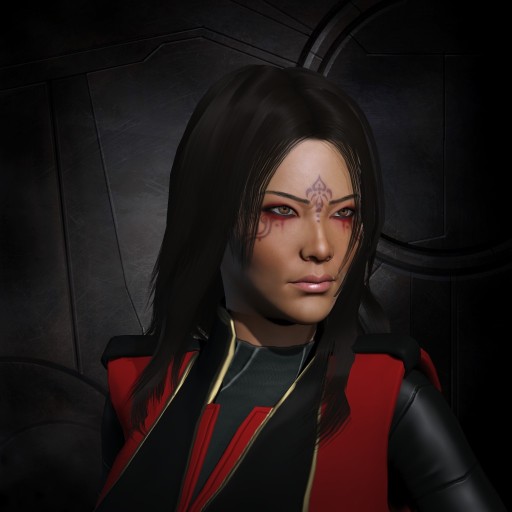
Clicky for larger version.  Honestly it needs updating, but I keep putting it off because I like the pose, even if it does look slightly awkward if you look at it for too long.  Reppy's amazing for WiS, actually - she somehow manages to appear bored and impatient the whole time, which fits her to a T  :lol:

[spoiler]

[/spoiler]

I don't like Elysa, unfortunately.  I did my best, but Carbon was extremely cruel to her.  I'll be doing a rebuild and reportrait when I get to reactivating her account.  Any thoughts?

[spoiler]
[/spoiler]

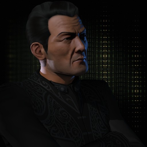
The original dude, who will likely never be reactivated now, so he's just around for posterity.  I'm still bitter about my helmet.  Despite the fact that I originally resolved never to show him without it, I think he turned out quite nicely.
Logged

Arnulf Ogunkoya

  • Moral Compass (apparently)
  • Pod Captain
  • Offline Offline
  • Posts: 650
    • Livejournal profile
Re: Character Portrait Rating
« Reply #134 on: 15 Jun 2013, 08:40 »

I decided to tweak Arnulf to match his chibi self's hair colour. Otherwise fairly unchanged.

[spoiler][/spoiler]
Logged
Kind Regards,
Arnulf Ogunkoya.
Pages: 1 ... 7 8 [9] 10 11 ... 33